
These are a new artistic form in that, among other matters, the covers can be apperceived without much or any interpretation.
The genius of New Yorker covers is that their topical allusions to politics or social life are so clear that the points of them are easily grasped even if there are points of meaning and nuance that allow but not require evaluation. I think that an illustrator who has managed to meet the rigorous standards of The New Yorker four or five times can consider himself to have accomplished a career. Let’s look at some of the more recent covers.
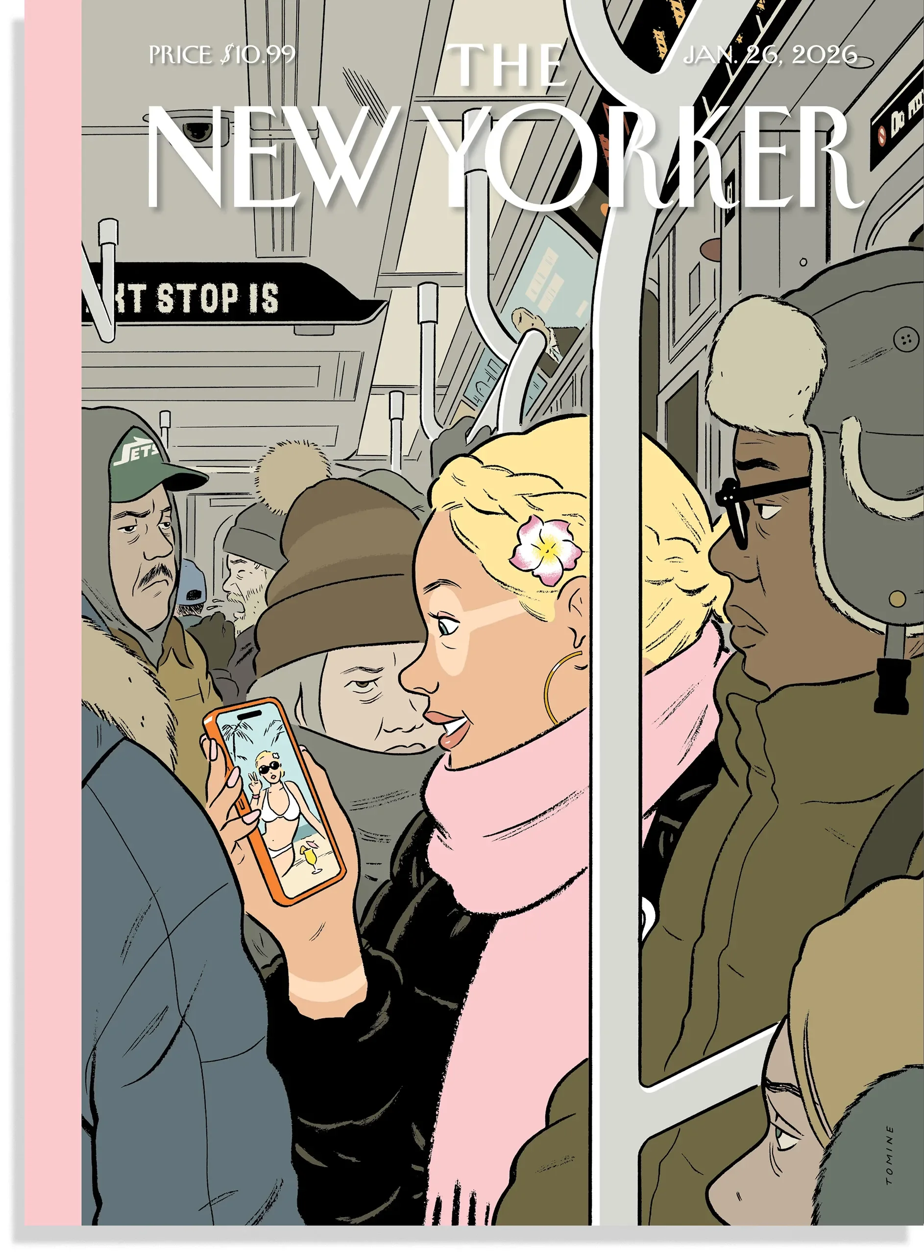
Adrian Tomine, Post-Vacation, January 19, 2026
A very recent cover, that of January 26th, 2026, was drawn by Adrian Tomine. (“Drawn” is the right word because the figures have hard edges and so the color fills in the outline.) The cover shows crowded people in a subway car in winter, the passengers bundled up. The central figure is a pretty blonde girl with an attractive and distinctive braid in her hair. The point that is a bit odd and may be overlooked even though she is striking and put in the center of the painting is that the areas around her are paler than the rest of her face’s skin. She has been apparently wearing eye goggles to cover up her eyes while sunning at a beach. That is amusing because it is an affectation of hip people, a current fad, and a sign of the moment when women can reveal the private ways they embellish themselves, as when in summer women’s shoulders can reveal the lighter skin of a bathing suit bra strap when they wear off the shoulder dresses. That is revealing but not immodestly so. What could Eve reveal now that she had to be clothed? Is the goggle mark a vulnerability or is it a mark of pride for being up to date?
The people in the car near her do not notice her display in that most subway riders assiduously avoid making eye contact with people whose spaces except in a subway car would be considered obtrusive, people deliberately disciplined to being anonymous even though each of the people close up on the blonde each also give off their own particular face and manner. There is an older woman right next to her who looks preoccupied or even snarly, I would suggest, and wears a brown and grey drab uniform while the blond who wears a pink turtleneck, which has become, at this moment, something of a uniform or at least the preferred fashion for women who appear in the media. The blonde offers an appealing smile at a cell phone photo of herself in a bathing suit to remind her of a friend or a nice summer day. Also nearby is a white man also in drab clothing who also looks or just seems to be distracted and whose distinguishing feature is not his narrow eyes but his drooping mustache -- the parted pencil style, I believe. Is everyone into decoration or at least in appearance management? A Black man sitting next to the blonde wears glasses and his hat has ear flaps of the sort I wore as a child. It strikes me or simply dates me to see an innocuous Black man in the car when the trope of the Black man a few decades back was that of him as a menace waiting for Bernie Goetz or Charles Bronson to come to the rescue. Or maybe the placement was intentional, to show how times and tropes moved on, the story properly assigned center stage the perky blond rather than a potential menace.
And that is to neglect two other minor figures in the car, and also the long bar cutting a vertical line across one third of the painting which lends some geometrical interest to the illustration as well as the sign in the car saying “NEXT STOP IS” which is familiar to subway rides and so helps to authenticate it, modern art since Lautrec including graphics in their presentations because a display of modern life is rarely without written words. So much information to include in a single illustration!
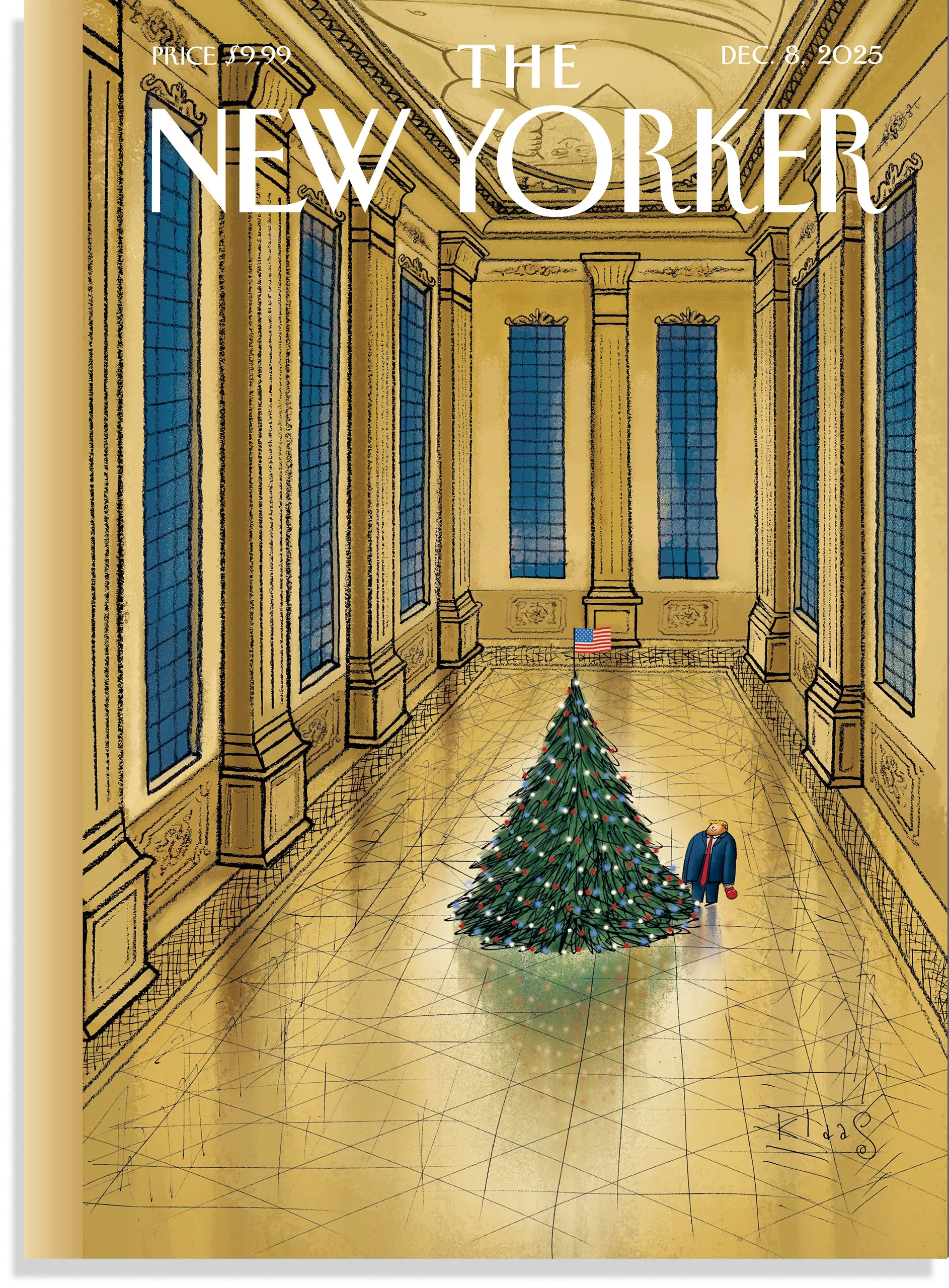
Klaas Verplancke, White House of Gold, December 1, 2025
Here is another recent New Yorker cover, that of December 8, 2025 and drawn by Klaas Verplancke. This cover is politically topical and whose visual aspects make the illustration deeper than caricature, which is the usual way Trump’s physical presence is made an object of fun. The President is seen looking like himself and imagined in the large room that is a reminder of his recent plan to build a giant ballroom where the East Room of the White House had been recently razed. But the room is very different from the one the White House presented as its plan for the ballroom. It had gold chandeliers and numerous tables and chairs. But the room in the cover is and the decorations are dark wood without filigrees and with columns. There are very high ceilings and narrow night blue windows from close to the top to close to bottom.The emotional tone of the room is ominous and a bit menacing, like a cave. The ballroom in the cover has no tables or chairs. Where are the people who attend to sit? Instead, there is the single figure of Trump standing alone in the empty room with a Christmas tree next to him. Both objects are diminished by the colossal size of the room, the two objects seen from above. The whole scene seems odd because, as an observer of the cover will realize, as I did for the first time, that Trump is rarely alone. He is surrounded by loads of people in the Oval Office and seems most comfortable going on for multi-hour speeches to the crowds who attend to him. His being alone seems unnatural and a kind of vulnerability different from the outrageous remarks he regularly utters. Purely artistic devices, such as color and decoration and relative size of the figure to its surroundings, have provided a new conceptual meaning for the kind of person this would be tyrant truly is.
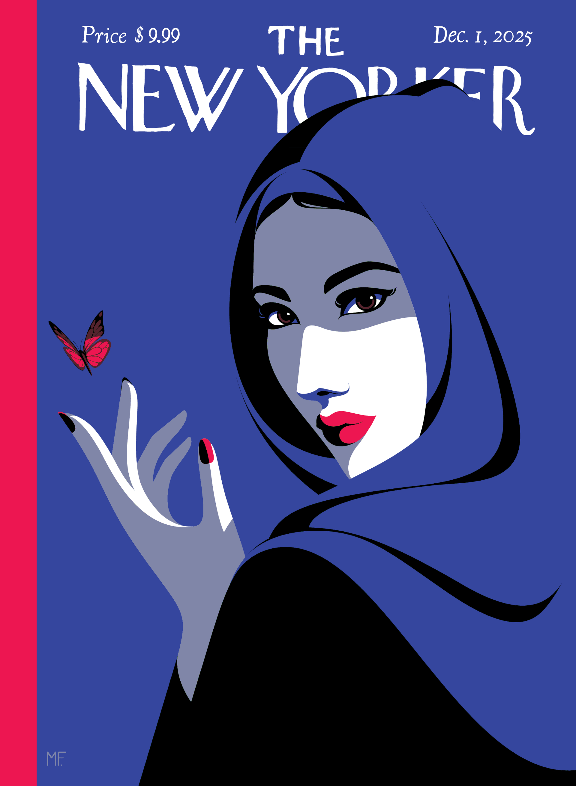
Malika Favre’s and Rea Irvin’s Eustace Tilley, November 24, 2025
A third New Yorker cover, on December 1, 2025 and drawn by Malika Favre, showed a pretty and alluring girl on its cover. Hardly surprising. Magazine covers have been doing that for a long time. Women’s magazines during the Golden Age of the Fifties also showed pretty women presumably so that female readers could identify with them or try to emulate them rather than find them attractive, which suggests evidence that women are looked at rather than being the lookers, the “Playgirl” magazine an exception. The more artistic significance of this cover is that it does without the charioscuro that dominated portraiture from before the Great Masters up to the beginning of the twentieth century with the exception of Goya, who constructed many of his faces with just smears. Rather, this cover follows the style of Alex Katz portraits. The shapes of the faces are without shadows, are cartoonlike, and resorts to other devices to individuate the subjects. In this case, there is the illusion of a gauze-like facial covering to separate the darker from the lighter bands of dark blue which is the color that dominates the picture, and that is contrasted with the dark red of her lips and fingernails.
But there is something else which makes the portrait topical. The partial veil provided by the shadow of her headscarf is an allusion to the scarf or facial hiding that takes place with Muslum women when they are in America and which seem to be politically threatening by many other Americans. That is understandable because since the Second World War, the adoption of Western dress has become universal. The Japanese and the Chinese, both men and women, wear western dress, which means men wear ties and suits and women wear dresses and pumps. The Indians still wear Nehru suits and saris, which is a half way compromise while the Saudis remain in their burnouses and robes and the women in particularly modest behavior, going so far as to adopt the burqa, which is a fully covered dress that only allows eye holes. Some people criticize that for making people unavailable. You can’t judge people if you can’t see their faces. France goes so far as barring women wearing burqas. But the United States treats ethnic dress as self decided because it is, as other aspects of ethnic assimilation, transitional. Just as in a few generations, new comers will learn English as their native tongues and so there is no need to make English the official language, so too Muslim girls in America gradually alter their traditional dress as they become more comfortably American. I have seen teenage Muslim girls with a headscarf and also tight jeans sitting next to their classmates who are fully Americanized.
What the cover is showing is assimilation to the point where except in memory or reflection, wearing veils is only a fashion style and more than that a sign of allure and not religious at all in itself, no longer even a sign of provinciality. It is an expression of self. We might expect that generations from now teenagers of all races might put on their walls confederate flags as a nostalgia for an era very long past rather than as a call for arms, though that is not now because it is still a tallying cry for people troubled by the Union or wanting to reestablish Fifties culture. The New Yorker cover is envisioning a more enlightened culture when veils are about sex, the universal solvent, rather than politics.
That thought is emphasized by the butterfly next to the young woman. That was originally associated with the New Yorker’s mascot, Eustace Tilley. The emblem of sophistication. But in recent decades that mascot was extended to women and Blacks and in this cover is extended to a Muslim woman. Everyone can be sophisticated.
Here is another observation. The various covers are striking because each issue has a distinct dominant color so as to call attention to the issue. That is different from Golden Age covers which used the whole spectrum of color photography so as to make them more realistic just as in the Forties the black and white photos of Life Magazine made them authentic even if picturing mammoth structures. Like dams. In the recent New Yorker covers, the one on Trump is brown and while the subway car highlights white, even to its masthead and the Muslim girl is used in versions of black. Color is used for effect and not just distinctiveness because color, for some metaphysical reason, conveys mood. If the Trump ballroom had been red rather than brown it would have conveyed regalness or perhaps death, as in Edgar Allan Poe’s “The Masque of the Red Death”, a short horror story from 1842.
Here is a perception that is a bit more subtle. New Yorker covers are easily accessible. They do not require critical interpretation to allow appreciation of their meaning. My own remarks seem superfluous. Rather, meanings of the covers are apperceived and spelling out the meaning unnecessary. You know the scarfed girl is pretty and you feel liberated at noticing that even if not saying in so many words that the liberation has come about by abandoning politics. Trump, in his turn, is diminished by being alone, maybe because he is seen rarely alone, though other leaders, like Lincoln in his memorial, is postured as sitting alone, a comparison a critic might make. The blonde girl in the subwaycar is the star of the show and the other figures in the subway car just reaffirm that.
That relation between the New Yorker covers and their audience is radically different than in prior or subsequent art. Impressionism was accessible to Monet only if you could leap the fence so that buildings in different lights were worth noticing as different and Manet, so straightforward, is indeed very complex in his choices of angles and distances that are worth explaining so as top appreciate meaning. Modernism required readers to unpack their puzzles and attend to detail so as to become as lofty for a moment as Joyce or Mann. Post-modernism or contemporary art requires viewers to think of things that are not art to be regarded as such, whether crashing automobiles or geographically arranged blocks whose structures are about nothing but their arrangements and not as impressive as the walls built at the time of Gilgamesh. So the New Yorker covers are a new form of art and people in the future will; notice it for being created as such.