
When Andy Warhol in the Sixties started making his silkscreens of Marilyn Monroe and Mao Tse Tung, he changed what art had been for twenty five hundred years or so and did something very different and not for the better. Previously, art had been a window into life, a depiction of scenes and arrangement and color that conveyed meaning and emotion, within a frame even if there was no frame and even if very large, as was still true in the Abstract Expressionism of the Fifties. Instead, the difference of one object to the other of his silkscreens were colors that added nothing to the emotion or meaning, instead only providing a differentiation that could allow even the multiple copies of one of the images differentiated enough to be peddled as being something different. Nothing changed after that revolution in that art has dry ironies but little emotion or arrangement, one exception being the quartet of women whose photo was taken every year and so allow how these distinct but familially related people age over time, true to the oldest instinct of portraiture, which is to see what is the person behind the face. I want to look at some of the holdings in the contemporary wing of the Chicago Art Institute to see whether I can reap something of value for my pre Warhol aesthetics.
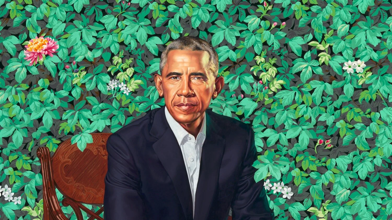
Here are some present exhibits at the Chicago Art Institute that are prominent pieces of art and seem to me to be fresh and the imprint of the last fifty years. Featured at the Institute are two portraits of Barack and Michelle Obama. The one of the ex President has distinguishing features very different from ones in prior portraits. Usually and famously as with George Washington, the backgrounds of portraits are bland or monocolored. And portraits in general in the past have put people in the place of their homes, as is the case with Vermeer and Hockney. In this case, the artist uses the background as green leaves adorned with flowers, and that background would in the past have seen busy and distracting but in this case are a pleasant contrast of green and red to the dark shades of the president's head, and so suggests a new way of being a portrait, a new setting for portraits. Here, Kehinde Wiley sits Obama on a carved chair, leaves overlooking the chair’s back and curled around his shoes. His posture is grave but not formal in that his white shirt is not buttoned. More important is the face itself which has introduced the talents of cartooning into portraiture, just as Alex Katz did by having people feel full and deep even though the outlines of his portraits are sharp edged while there are few shadows in his pinkish faces. Quite a mystery and a success.
What is the point of the leaves and the flowers? Partly, just to be different from the usual way portraits are done for high class people. Gainsborough beer barons had an interesting background in their estate so that showed how much had risen. But art finds its way to do something. Intiscase, even a portrait of an ex-president is embellished by adding a decoration that fills its background because it would otherwise seem empty or now that it has been seen necessary to fill it out, as if portraits from now on would have foliage or something else to add to them. Tisis a new eye, that decoration is necessary when for so long the taste in architecture and in painting was to be minimalist. This is a refreshing view, a fact embellished in the last few days when the New York Times reminded viewers that there was a vogue for decoration in the immediately post Abstract Impressionism art scene, where the focus of art was not on the meanings and seriousness of portraying historical and other events, or on capturing people, or pointing, like Abstract Impressionism, to the enormity of the depthless spaces of one dimensional objects, glimpses into the great maw of eternity. Rather, decoration was pleasant rather than deep, designs of line and color to amuse the eye and distract it rather than to capture it, like paintings of leaves put in hotel rooms. It is a thing akin to art not usually thought to be art, but here it is again, fifty years later, alive and well in Chicago.
For her part, the artist also uses cartoonish techniques by providing dark dashes for Obama’s eyebrows and strong, clear lines to show the folds in his face and more pursed lips. His expression is also descriptive in a way that makes him different from the exPresident’s usual facial posture. His face is not smiling or stoical. Rather, his eyes and mouth seem cross or even angry, and so gives a different sense of his familiar face. But even if the facial posture is different, Obama is quite recognizable, just a different set of emotions, and so different from the statue of Martin Luther King, Jr. in Washington D. C. which doesn’t look at all like King because it is poorly sculpted, the shape of the face different, as is also the case in the portrait of Michelle, done by Amy Sherald, that sits next to the portrait of the ex-President. Its monotones are white and grey, and so don’t make her black at all, which she so clearly and proudly is, and she is dressed as a model waiting for a photoshoot, which is definitely what she is not even if many admiring photographers were out to make her that way.
It should also be said that the presentation of the two portraits by the Chicago Art Institute are off putting. Visitors are escorted through three or so rooms or aisles before getting to the two portraits, perhaps so as to move people in a way so lines can move more quickly and give people a chance to look more carefully at the two portraits, but the walls are cluttered with advertisements and blurbs for the artists rather than the subjects for the art and so make it more political rather than an artistic accomplishment and are self aggrandizing. There is no need with such an introduction when you enter the room where is to be seen the “Mona Lisa”, though that room is crowded and so a visitor lacks patience to study that masterpiece at length, though other museums such as the Met don’t make it difficult to pause and ponder its masterpieces.
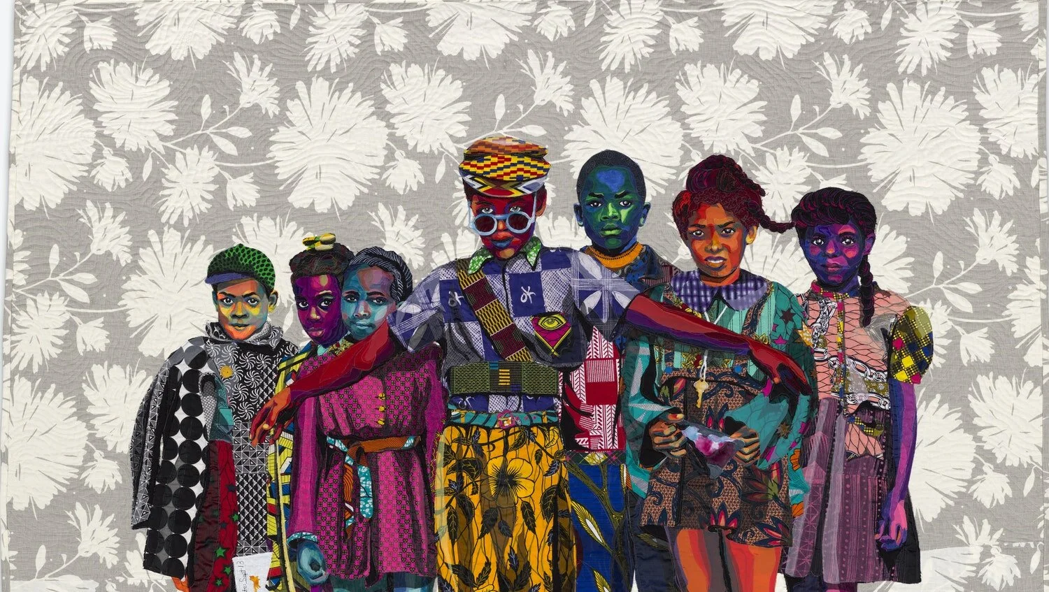
Another exhibition on display at the Chicago Art Institute that is also devoted to decoration is Bia Butler’s quilts that are like paintings and whose subject matters are portraits of an assemblage of black people in contemporary urban areas and in history. Although the artist has made a number of these artworks that are all remarkably high in quality. One that strikes out to me is ”The Safety Patrol”, created in 1973, early on in her career when decoration was also in vogue, as the New York Times reminded us a few days ago. Butler’s quilt shows a picture of a school guardian watching out for and guiding young children. The colors are unusual but more important are the clothing which have a variety of patterns within each dress or pants or shirts. Taylor’s insight was not to consider whether a single dress or the overall array of pants, shirts and dresses are to become part of an overall pattern. Rather, the viewer looks at the variety for itself, impressed by how complex is an individual bit of clothing and somewhat overwhelmed by the variety, the point of the clothing to display every one of the people adorned by their decoration even if some of the clothing could be read as close to tatters.Everyone looks exotic because each of the articles of clothing are distinctive and complex.
The boy farthest to the left in “The Safety Patrol '' wears on his shirt blacreet patrk and yes it is a kind of uniform but it is made up of the motley array with white markings and red and green details. The girl to his immediate right has yellow stripes checked with black arrows against a blue background. The girl next on the right has purple and black boxes on her dress and a blue sash and what she wears under her dress is also blue. Spectacular is the quirky street patrol guard who is older than those he guards and is the center of the scene, a bit in front of the others. He is wearing an assemblage that indicates a uniform but is made up of the motley attire that adorns the children. He has belts and sashes telling authority but no badge to make it so. His pants are baggy and of camouflage colors as if also part of a military uniform, but maybe just his style. A girl even further right wears a blue and white shirt with “OK”s on it, and there are numerous details for everyone, such as a green color that a viver might miss because she is partly covered over but thee fact of their being a great variety of things happening to the clothes of every one of the children and their guard. Ht black faces have a number of skin tones. The same could be said of white people. aThe point is the unusual collection of colors that are used to make up each face.
The faces are difficult to fathom because they are so different from one another in shape and skin tone and because each of them have shadows that are created through changes in patches of color rather than through shading. The boy most to the left has an orange and brown shade with highlights of green on his face to show the cleavages and depressions in any person’s face. The girl next on the right is blue with brown highlights. The girl to the right of the patrolman is blue faced and has white shadows. The girl next to the right is brown and the one after that is dark brown with purple highlights. It Isn't that black faces have a number of skin tones. The same could be said of white people. The point is the unusual collection of colors that are used to make up each face.
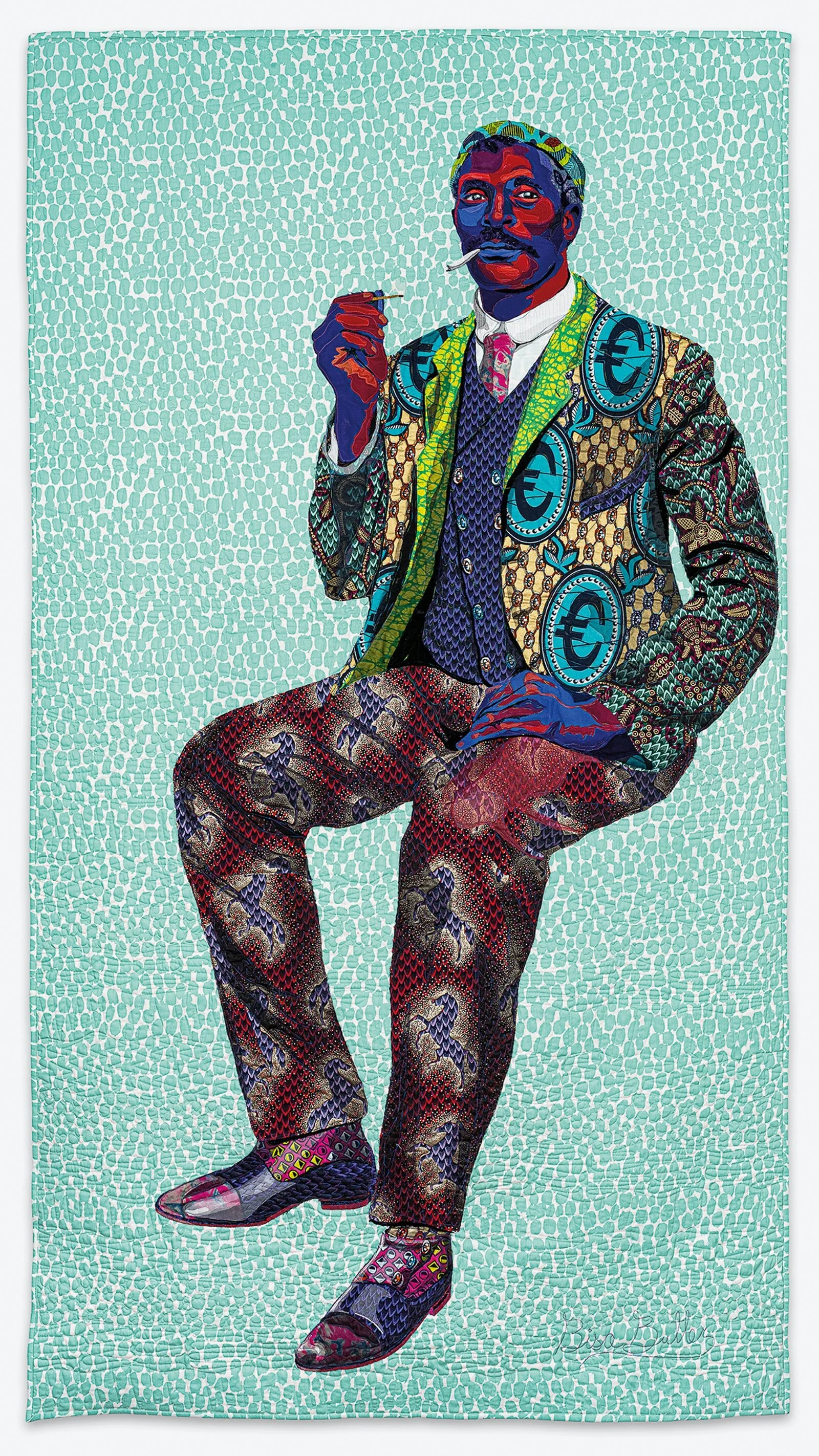
Another of Butler’s quilts is the single portrait called “A Man’s Worth”, from that same 1973, the point easily made that a man can be judged by the quality of the goods he wears. The man is all dressed up with black horses on pants in reddish purple while his jacket has blue English pound signs in blue and black on a jacket that is yellow and with crossed lines in its design. Underneath the jacket is a blue vest with gold buttons. To finish this off with a muted taste is a white shirt and a red tie. The fellow sports a cigarette. Quite a dude-- and don’t forget that the shoes are also multi-hued..
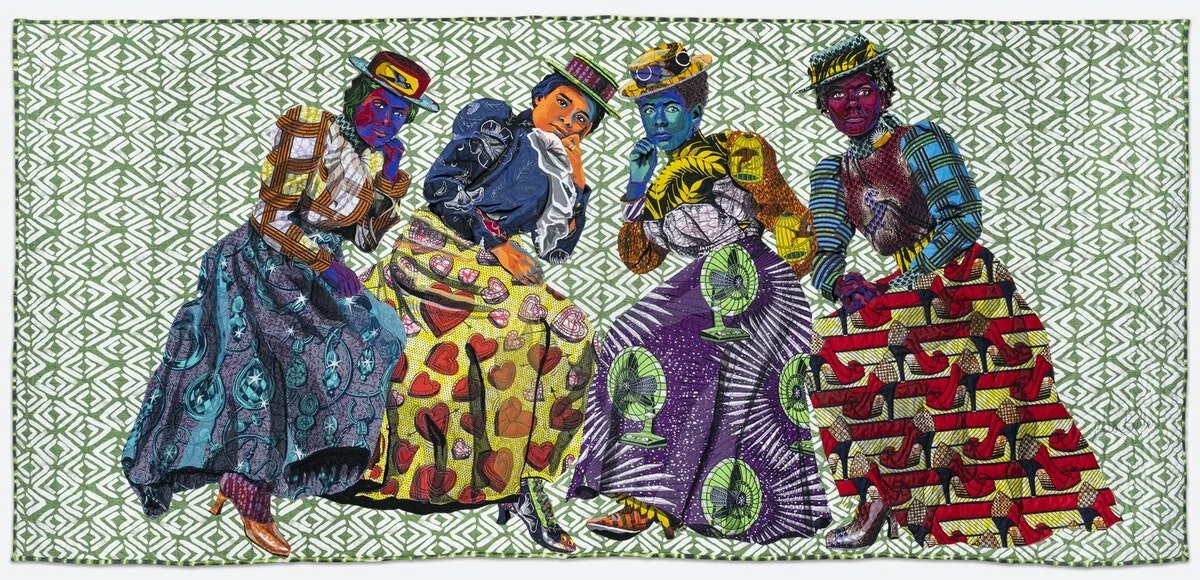
Butler continues to fail to disappoint in that each of the people in her multiple or individual portraits has surprising colors and designs. What stands out for the collection as a whole is how resplendent are the clothing and the people assembled, as if they were theatrical performers rather than normal people dressing in the ways they do that dulled people will not appreciate for their splendor. Everyone is a showgirl. I must also take notice of something of Butler’s work that would not be visible in photographs but is clear in the original weavings. She is able through her elaborate plan of how to place strands into the weave to create effects that are very painterly, such as the drapery created in the more than century old clothing styles found in Butler’s “I Know How the Caged Bird Sings”, from 2019, she having appropriated an historical reference to give the display of people resonance, though that is not required in that the displays are outstanding and moving regardless of their historical placement. How they dress is more important than what they do. Design is central while the dress of historically important figures is incidental,
I do continue to ponder the social fad but it may be more substantial. significance of women moving in short order from shirtwaists to flapperdom. Men were particularly bereft of design or decoration in their clothing throughout the nineteenth century and beyond. It became so bad that in the Thirties all men dressed for the occasion wore tails and bowties, even though the clothing of women were also pretty humdrum. Only with the forties was there a boldness in women’s clothing and men moving to suits, but even today and even if they have designer tuxedos, men are jackets and pants, and even the shirts had more color than was the case just a few years ago.o fashion plates. Butler may be introducing something that was gone for two hundred years. It may be a fad but it may be more substantial. I went to Marshall Field's when I was in Chicago and saw on display jackets and pants in glowing colors and elaborate flowers on their white clothing. Even the mens shirts had more color and design to them than were the case a few years ago. Maybe a revival of the psychedelic colors of the Seventies. Something refreshing in an age of rancid political bickering that Biden tries to avoid and cultural issues only about racial and gender inequality. Real as those things may be, life is more than that. It is about, more deeply, the human rather than the ethnic condition and even about the wonder of how people and ostriches display themselves.